It's common for loan requirements and for preservation goals to have a daily fluctuation threshold as these big changes in temperature and humidity in a shorter timespan can have consequences to objects that are sensitive to swings in the environment. Conserv has made it easy to define a fluctuation threshold and then visualize a space's performance against that definition.
Setting up your Fluctuation Levels
Before you get started, you'll want to make sure you have your levels setup correctly and have your fluctuation levels defined. You can get a high-level overview about how levels work in this article, Understand Levels. In order to get to your levels to edit them you'll need to go to "Setup" and then make sure the "Levels" tab is selected. You can edit existing levels by clicking on them or create new ones. Then you can drag and drop your spaces into the appropriate one. Fluctuation thresholds for temperature and humidity are based on 24 hours and these are the numbers seen in the parentheses in the level profile (as seen below).

Visualizing Fluctuation Metrics as a Key Performance Indicator
Now that you've defined your fluctuation level you can see how a space is performing against that level by looking at the Key Performance Indicator (KPI) circle at the top of the analytics screen. You'll need to make sure "Show KPI's" is toggled on from the "Customize" menu. Once selected you'll see the KPI's for whatever readings you have selected. For example, if you have Relative Humidity selected you will see these KPI metrics.

The circle on the right with the up/down arrows represents the percentage in time the relative humidity stayed within the fluctuation range selected as your level for that space.
The logic for what % of the time the readings are within the maximum allowed 24h-fluctuation set by the user is the following:
For every reading within the time period the user requests, the software looks at all the readings 24 hours prior. Within that 24h period, it takes the maximum reading it finds and subtracts the minimum reading it finds.
This difference will be either under or over the maximum fluctuation the user has set (which can be found in the level profile settings). If the difference is below the target set by the user, it marks the reading as within specification.
If not, it marks it as outside specification. Once it has that in/out specification defined for every individual reading in the chosen time period, it divides all the within specification readings over the total number of readings for the period.
% in flux (fluctuation) formula
# of readings within specification / total # of readings for your period chosen * 100%
Visualizing the Fluctuation Metric as a Time Series Graph (Fluctuation Chart)
Pro customers have the ability to graph their fluctuation metrics with the addition of the "Fluctuation Chart." In order to turn on this feature you must go to the "Customize" menu within the Analytics and toggle on "Show Fluctuation Chart." The chart should appear on the analytics screen below your primary graph and it will show the fluctuations over time for readings you have selected (temperature and/or relative humidity). The graph is helpful if you need to report on the number of times your fluctuations have exceeded your level threshold. You will see your level threshold visualized as a dotted line on the graph.
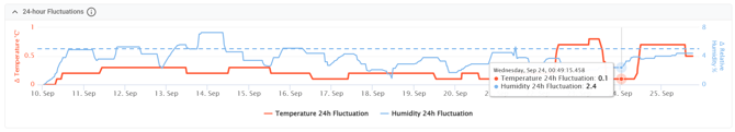
Each datapoint on this line series is a graphical representation of the difference between the highest and lowest datapoints in the previous 24 hours so when you're hovering over the graph and you see the values on the graph it is showing the biggest fluctuation that happened in the past 24 hours.
⚠️ Illuminance
Illuminance does not use a fluctuation percentage; instead, cumulative lux hours are key for light exposure tracking.