Table of Contents
- View Today's Data
- Select Sensors for Viewing
- Select a Default Favorite Time Period
- Collapse the Sidebar
- Use the 24hr Fluctuation Option
- Use the Zoom Feature
- Edit Level Band Visualization
- Edit the Vertical Axis Points
- View Weather Data
View Today's Data
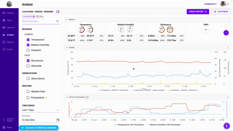
The new analytics defaults to showing all your data points (no aggregation), which preserves spikes and gaps that are critical for analysis. For longer time ranges, a smart downsampling algorithm reduces visual clutter while preserving the true shape of your data — you'll see a "downsampled" indicator on the chart when this is active.
You can also choose your preferred aggregation level from the Customize menu to control how your data is displayed. 15-minute and hourly aggregations are available in the CUSTOMIZE menu under CHART OPTIONS.

Select Sensors for Viewing
- Sign in to Conserv Cloud
- Click Analyze on the left navigation pane or click the bar graph icon in any sensor.
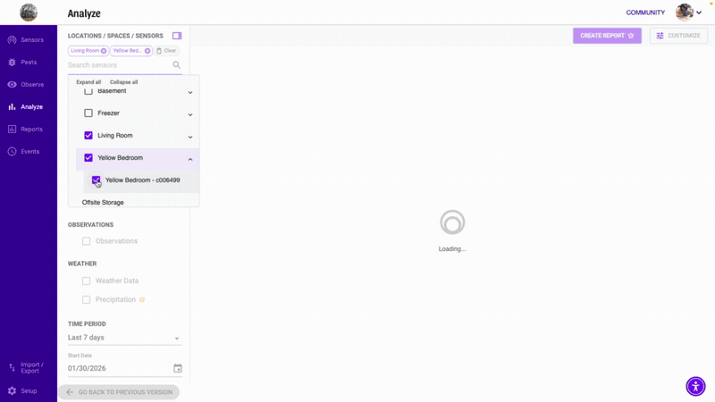
- Use the data selection panel under LOCATIONS / SPACES / SENSORS. Type to search for a specific space or sensor, or browse the dropdown tree view. You can select multiple sensors and multiple data types (temperature, RH, dewpoint, illuminance, UV) to view all at once.
- Hover over any line in the graph to highlight it.
- Click any item in the legend under the graph to temporarily hide or show it without removing that sensor from your selections — great for isolating a specific sensor in a busy chart.
Select a Default Favorite Time Period
- Sign in to Conserv Cloud
- Click Analyze on the left navigation pane or click the bar graph icon in any sensor.
- Click the star next to any TIME PERIOD. That range will load first automatically every time you open Analytics.

Collapse the Sidebar
Click the collapse button to hide the left-hand selection panel and give your graph the full screen width.
Use the 24hr Fluctuation Option
👑 Fluctuation Charts are a paid feature and only available for Pro, Complete and Enterprise customers.
24-hour fluctuations are calculated as the maximum difference between the maximum and minimum readings in the past 24 hours for each available reading. A dotted line will indicate the maximum allowance set by the user in the Level assigned to the sensor being shown. To learn more about Levels, see Understand Levels.

The 24-hour fluctuation line graph can be toggled on or off in the CUSTOMIZE menu.
- Sign in to Conserv Cloud.
- In the left navigation menu, select Analytics or select a sensor from the Sensor page using the bar graph icon.
- Open the CUSTOMIZE menu on the top right of the graph.
- Toggle the Show Fluctuation Chart on or off under the METRICS section.
METRICS are only available for Pro customers.
Use the Zoom Feature
For a closer look at a section of data on a graph, you can use the drag-to-zoom feature.
- Sign in to Conserv Cloud.
- In the left navigation menu, select Analytics.
- Hover over the start point of the date range that you want to focus on.
- Click and drag across the graph to your end point.
When you release the click, the graph zooms in to show your selected range.

To return to the full graph view, click Cancel or Reset Zoom.
Edit Level Band Visualization
- Sign in to Conserv Cloud.
- In the left navigation menu, select Analytics.
- On the top right of the graph, select CUSTOMIZE.
- Under CHART OPTIONS use the Show Levels dropdown to select Never, On hover, or Always.
Edit the Vertical Axis Points
- Sign in to Conserv Cloud.
- In the left navigation menu, select Analytics.
- On the top right of the graph, select CUSTOMIZE.
- Scroll down to LAYOUT and check the Autoscale options or input your desired scale.
View Weather Data
You will find the Weather check box above the TIME PERIOD selector. Weather only appears for one sensor at a time. If multiple sensors are selected, the boxes may look greyed out.
👑 Precipitation is also available for Pro, Complete and Enterprise customers.
